Most agents return text. Even when the answer is a list of products, a row of data, or a set of locations you really want to see laid out visually. Text is what the model produces. Text is what the user reads.
We have been living with that constraint for a while. Today we are changing it.
Display modes
Your assistant can now render its replies as cards, charts, tables, maps, or Mermaid diagrams. There are two ways in.
Turn on a display mode for an existing power-up. A growing set of selected power-ups now support display modes. Open the power-up's settings, look for the Display section, pick a mode, write a short transform prompt to shape the response, and the data renders as a visual component instead of text.
Add a standalone Display power-up to your agent. We have also shipped Display Cards, Display Chart, Display Table, Display Map, and Display Mermaid as power-ups in their own right. Once one of these is on a agent, the assistant can decide to render anything as that display mode at any point in the conversation. No data source required. Just plug it in and the agent can answer with a chart, a map, a diagram, or a set of cards whenever it makes sense.
That second route is the one that makes things properly dynamic. Your agent can pull data from anywhere, and on its own decide to put it in a table, sketch a flowchart on the fly, or list matches as a carousel of cards.
What you can render
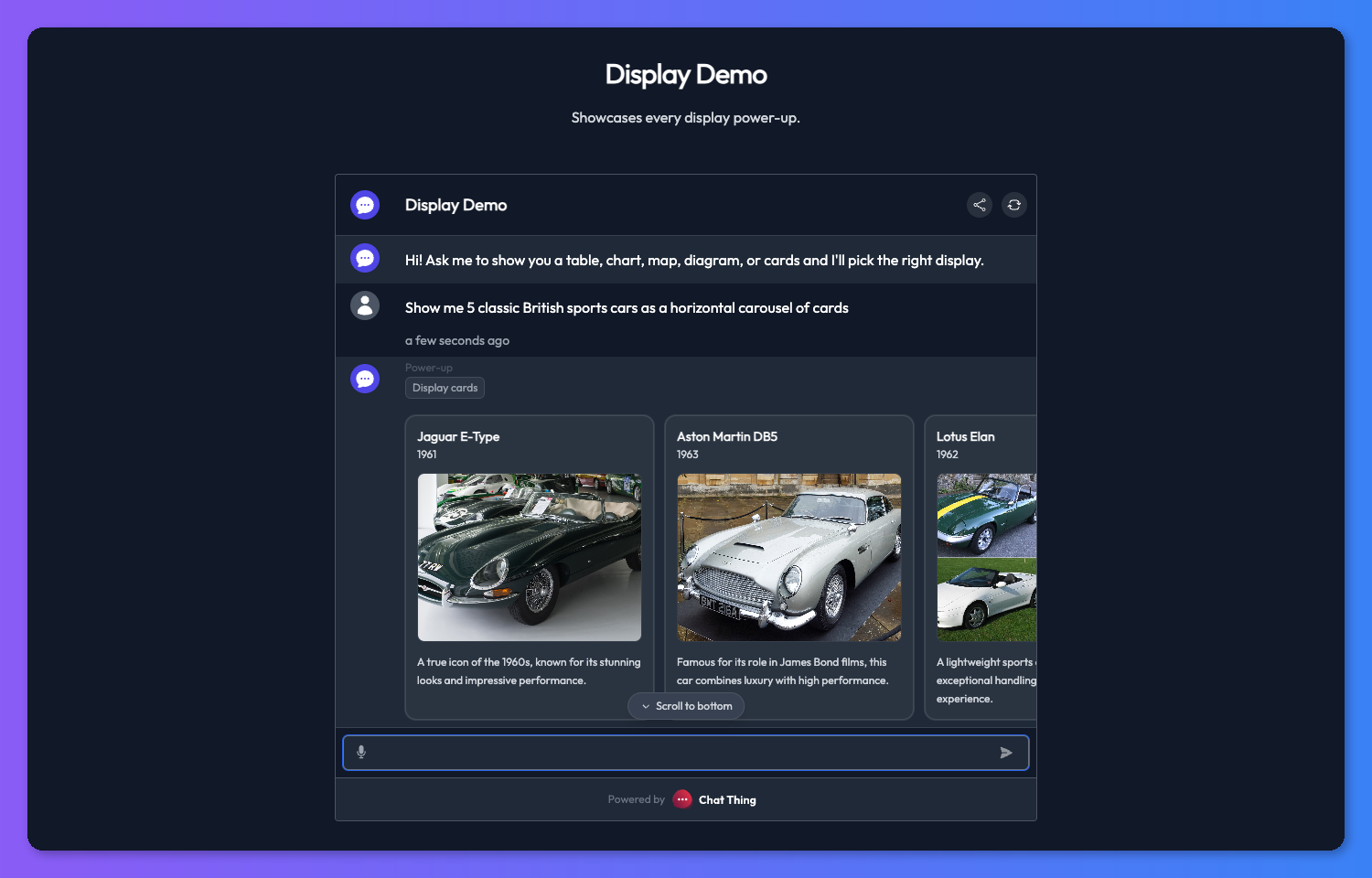
Cards
A horizontal carousel or vertical stack of items, each with a title, description, optional image, and a link. Great for anything you would otherwise list out.
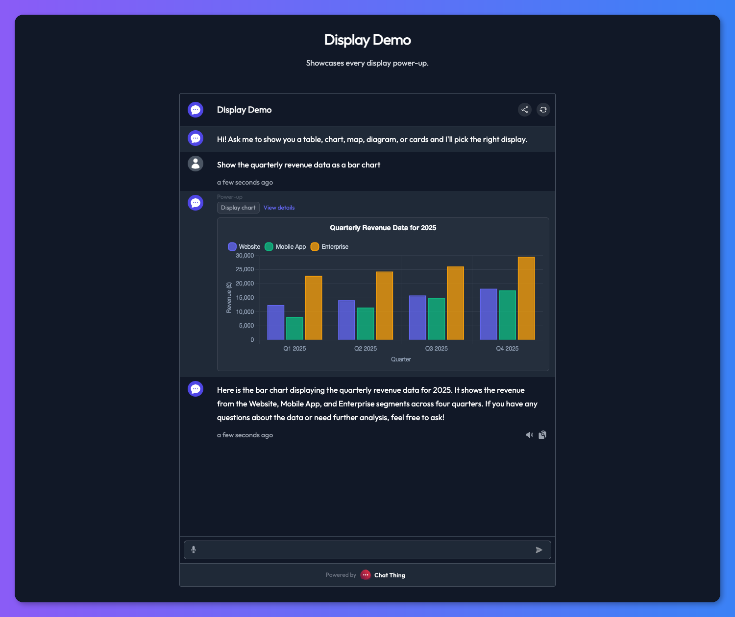
Charts
Bar, line, pie, or doughnut. Connect to numeric data and your assistant can visualise it. Useful for sales figures, usage stats, results over time.
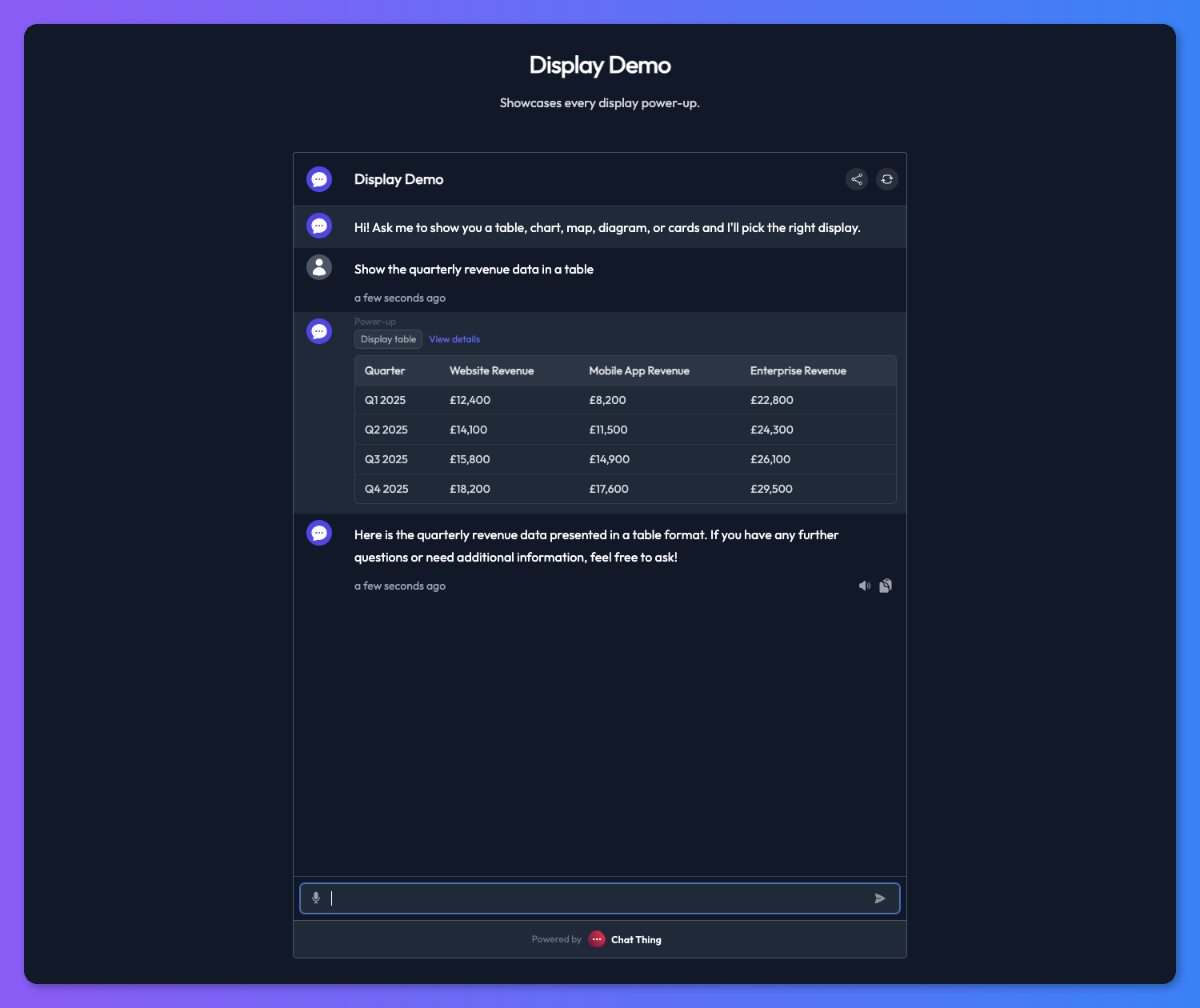
Tables
Structured rows and columns with text, image, and link column types. Clean and readable. Better than prose any time the answer is a comparison.
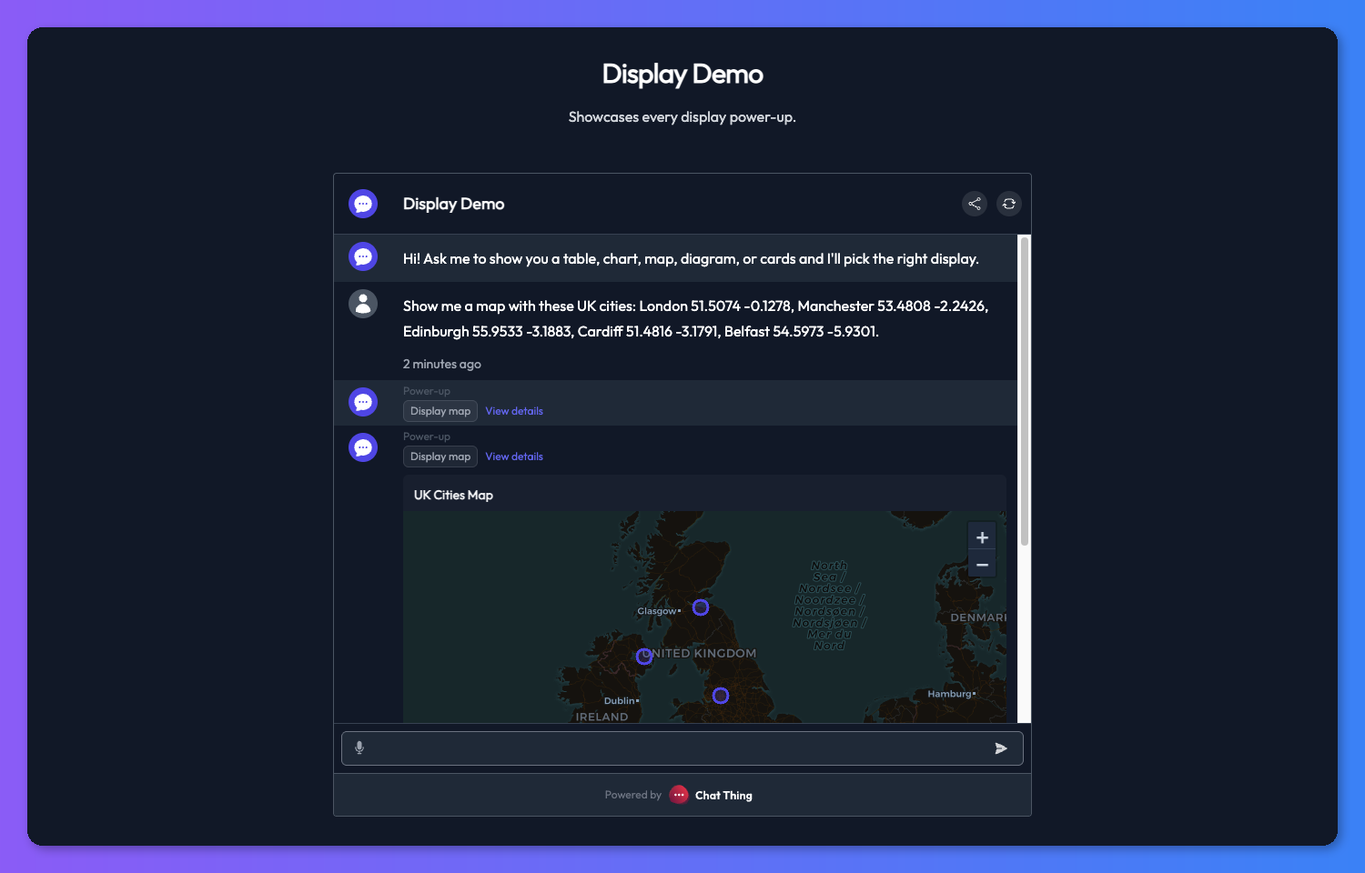
Maps
GeoJSON points, lines, and polygons, with auto, light, or dark styles. If your bot answers location questions, it can put the answer on a map.
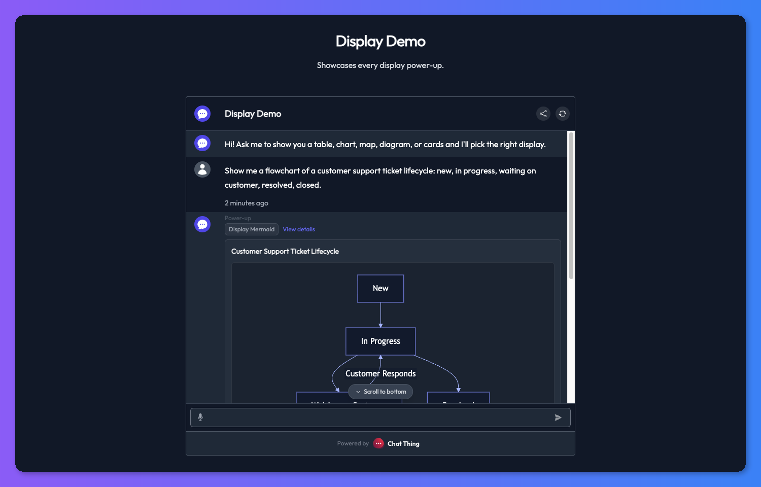
Mermaid diagrams
Flowcharts, sequence diagrams, entity-relationship diagrams, and more. The one that surprises people if you are building tooling for developers or ops teams.
Who this is for
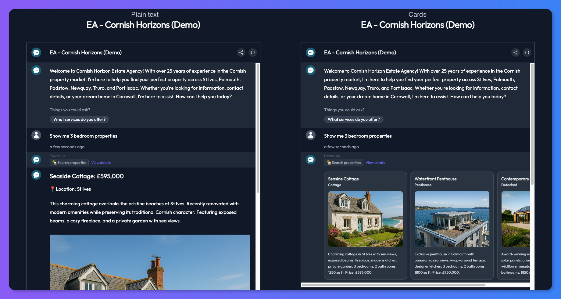
If you run a real estate or e-commerce bot, cards are the obvious win. Property listings or product results show up as a browsable carousel with images, prices, and links, rather than a flat bullet list. Anywhere your bot is listing things out — results, jobs, articles, search hits — cards make it feel like a proper product instead of a chat log.
If you run a support, ops, or analytics bot, charts and tables turn questions about numbers into something you can read at a glance.
If your bot does location lookups, store finders, property maps, field service, a map answers the question properly.
If you are building internal or developer tooling, Mermaid lets your bot draw what it is describing.
In short: any time the bot is listing things, comparing things, or describing somewhere or something with structure, there is a display mode that does the job better than prose.
How the transform works
When you turn a display mode on for an existing power-up, you write a short transform prompt that tells the model how to convert the raw response into the right shape for the display type. The transform runs after the power-up call. No extra API calls, no preprocessing, just a prompt.
![]()
The standalone Display power-ups skip that step. The bot calls them directly with structured data, which is what makes them so flexible.
Getting started
Open the bot you want to upgrade. Either turn on a display mode in the Display section of any supporting power-up, or add one of the standalone Display power-ups (Cards, Chart, Table, Map, Mermaid).
Live today on all paid plans.
What's next this week
Day 2 of five. Tomorrow we replace the dashboard you don't read with analytics that actually tell you something.